You've seen those comparison pages. SaaS companies write them to compare their product to their competitors, feature by feature. And while they're helpful, one can't avoid thinking:
How biased are these results?
If company X is comparing itself to company Y, you'll undoubtedly assume that they're painting the better picture for themselves.
Crisp found a nice solution to this issue. They wrote a massive library of comparison pages. And when I mean massive - I'm talking about more than 600 pages in total. Each of them with detailed comparisons.
And the big insight here? They compared their competitors against themselves. You'll find Crisp compared to X and Y, but also comparisons of X vs. Y.
This is a genius play for SEO and credibility. And today, we'll be breaking it down.
What is Crisp?
Note to keep us on the same page: Crisp is a complete toolkit for customer support. It includes live chat, knowledge bases, and a CRM to make interactions between a brand and its users a breeze.
Now - what’s this comparison hub all about?
Taking a look at the Crisp comparison hub
As I have mentioned, Crisp has over 600 comparison pages published.
This is a prime example of programmatic SEO - through research on alternatives to their service, the team created hundreds of pages that are now ranking on Google.
Adding this to the fact that Crisp has over 1.2 million backlinks and a good domain ranking (84 on Ahrefs), we have a winning recipe. But what does this tell us about how we can build better content?
What can you learn from the Crisp comparison pages?
Looking at Crisp's pages, we can notice several features.
Features first
No fluff, no extra talk - when you open the page, you jump straight into what matters - this is the actual feature breakdown and comparison. After all, this is what you came here for.
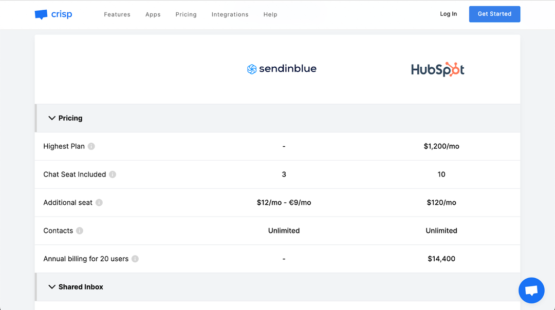
Make it look dynamic and trustworthy
In addition, they included thoughtful detail by adding the option to contact them in case of any mistake. And guess what - once you click, a new chat opens, giving you the opportunity to test out the product. Genius!

Descriptions of each app
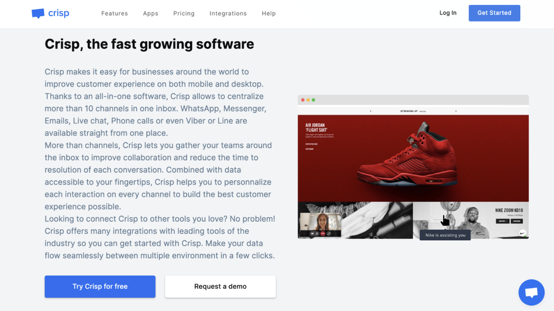
That is good for SEO. Having descriptions of each app helps increase relevance for Google. And they also plug in their own description together with social proof. It’s a great first impression for top-of-the-funnel users.
But, I would also like to bring your attention to another brand doing good comparison pages: Ghost.
What’s Ghost?
Putting it simply, Ghost is a publishing platform. With it, you can create a blog with a built-in newsletter to start shipping out content.
It’s made for creators as it gives them good-looking hemes and easy monetization options. And when it comes to comparisons, they pulled it off.
What can you learn from the Ghost comparison pages?
I want you to notice two main points.
Being honest with what you excel at
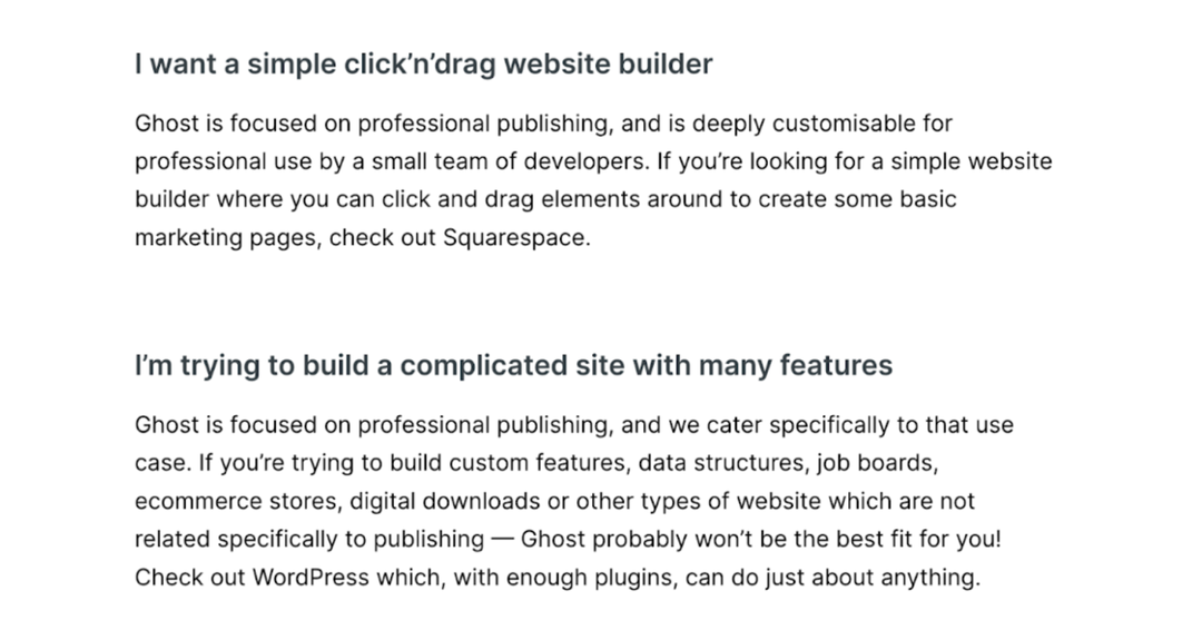
When you go to the hub of their comparison pages, you’ll find a series of FAQs that explain what Ghost can and can’t do. And this is super helpful, as you’re giving potential users immediate answers to any questions they might have. This in turn assures they get more qualified users, which in turn reduces the future burden on their support systems.
Showcase the benefit on-page
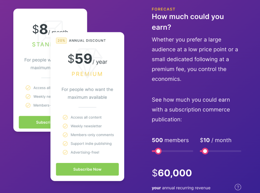
I also love this little widget they’ve included. Any user can check on the spot how much they could make with their own independent publication. It’s an important detail that reinforces the value of using an independent platform and feeds into their brand promise (“Turn your audience into a business”).
Conclusions
These tips sum up pretty much everything you need to know to create proper comparison pages. Remember: when a user is deciding between you and a competitor, they will read these pages - so make sure you get them right!
To recap, you should:
- Start with features first
- Make the list seem up-to-date and unbiased
- Add descriptions of each app
- Reinforce the value
- Handle objections immediately and be honest about what you don’t do
And that’s it! If you ever need a place to create your hub of comparisons, make sure that you checkout Notice. It comes with a built-in OpenAI integration that adapts to your writing style, and you can create whatever structure you wish for your content.

